Mobile devices have become a crucial aspect of our lives in the current digital age. People use smartphones and tablets to access the internet, conduct informational searches, and communicate with online vendors. As a result, having a website that is optimized for mobile devices has become crucial. We’ll talk about the importance of responsive web design and how it can improve user experience on various devices in this blog article. We will also delve into the process of crafting responsive WordPress websites, highlighting the importance of considering the needs of mobile users. So, let’s dive in and discover the world of responsive web design.
Table of Contents
Understanding Responsive Website Design

Responsive web design is an approach that ensures a website’s layout, content, and elements adapt seamlessly to various screen sizes and resolutions. It provides users with an optimal viewing experience, whether they access the website on a desktop computer, laptop, tablet, or smartphone. The prevalence of mobile devices has made responsive web design more of a need than a luxury.
When implementing responsive design, developers use fluid grids, flexible images, and media queries to ensure that the website’s layout adjusts dynamically based on the user’s device. This fluidity allows the content to reflow and resize intelligently, creating a visually appealing and user-friendly experience. Whether it’s an e-commerce site, a blog, or a corporate website, responsiveness has become a crucial factor for success in the online world.
The Importance of Mobile-Friendly WordPress Websites

Millions of websites worldwide are powered by WordPress, a well-liked WordPress-based content management system (CMS). Its flexibility and user-friendly interface make it an ideal platform for creating mobile-friendly websites. WordPress themes and plugins are widely available, giving developers access to strong tools that help them create responsive websites quickly.
Having a mobile-friendly WordPress website brings numerous benefits. Firstly, it improves the user experience by providing an optimized layout and navigation for mobile users. It eliminates the need for zooming or horizontal scrolling, ensuring that visitors can effortlessly interact with the website on their mobile devices.
Also Read:
- Future of WordPress: Top 10 Best WordPress Themes in 2023
- How to Customize WordPress Login Page? The Easy Way
- Why Managed WordPress Hosting is Better Choice Over Shared Hosting?
- 10 WordPress SEO Tips to Increase Your Rankings
- The Ultimate To-Do List for New WordPress Sites
Secondly, a mobile-friendly website positively impacts search engine rankings. Mobile-friendly websites are given priority in the search results of search engines like Google. Therefore, having a responsive WordPress website increases the chances of being discovered by users searching for relevant keywords, such as responsive web design Sydney.
Thirdly, a mobile-friendly website contributes to higher conversion rates. Visitors are more likely to engage with the information, investigate products or services, and make purchases when they have a seamless and pleasurable mobile experience.
Crafting Responsive WordPress Websites for All Devices
Crafting a responsive WordPress website involves a series of essential steps to ensure a smooth and visually appealing experience across different devices.
Selecting a Responsive Theme

Choosing a responsive theme from the vast collection available in the WordPress theme directory or premium theme marketplaces is the first step. A responsive theme provides a solid foundation for building a mobile-friendly website.
Optimizing Content for Mobile
Creating mobile-friendly content involves concise and scannable text, properly-sized images, and well-organized layouts. Short paragraphs, bullet points, and clear headings make content more digestible on smaller screens.
Prioritizing Navigation and User Interface
Simplifying navigation and ensuring easy access to essential elements are critical for a mobile-friendly website. Large, touch-friendly buttons and intuitive menus enhance the user experience.
Optimizing Page Load Speed
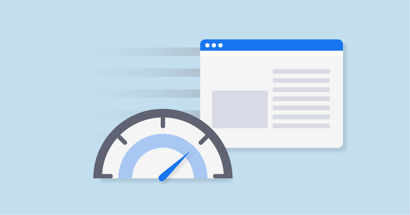
Mobile users expect fast-loading websites. Optimizing image sizes, minimizing the use of external scripts, and implementing caching techniques are effective strategies to improve page load speed.
Testing Across Devices and Platforms
Thorough testing on different devices and platforms is essential to ensure consistent performance and visual appeal. It allows for identifying and rectifying any potential issues that may arise.
Implementing Mobile-Friendly Plugins
WordPress offers a wide range of plugins specifically designed to enhance the mobile experience. These plugins can assist in optimizing images, improving caching, implementing mobile-specific features, and ensuring compatibility across different devices. By utilizing these plugins, you can further enhance the mobile-friendliness of your WordPress website.
Optimizing Forms and Calls to Action:
Forms and calls to action are crucial elements of a website, as they drive user engagement and conversions. When crafting a mobile-friendly WordPress website, it’s essential to optimize forms and calls to action for mobile users. This includes using clear and concise form fields, using appropriate input types for mobile devices (such as date pickers or dropdown menus), and placing calls to action prominently for easy access.
Ensuring Cross-Browser Compatibility
Browsers like Safari, Chrome, Firefox, and others are used by mobile users to access the web. To ensure a consistent user experience, it’s important to test your responsive WordPress website across different browsers and ensure compatibility. This step helps identify any potential issues and allows you to make necessary adjustments to ensure a seamless experience for all users.
Considering Touchscreen Interactions
Unlike desktop users who rely on a mouse and keyboard, mobile users navigate websites using touchscreens. When crafting a responsive WordPress website, it’s crucial to consider touchscreen interactions. This includes ensuring that buttons and links are large enough to be easily tapped, avoiding placing interactive elements too close together to prevent accidental touches and optimizing scrolling behavior for touchscreens.
Monitoring and Analyzing User Behavior

After launching your responsive WordPress website, it’s important to monitor and analyze user behavior to gain insights into how users interact with your website on different devices. Tools like Google Analytics can provide valuable data about mobile traffic, bounce rates, conversion rates, and more. You can find areas for improvement and make data-driven decisions to improve the user experience across a variety of devices by studying this data.
Conclusion
Crafting a responsive and mobile-friendly WordPress website is no longer an option but a necessity in today’s digital landscape. With the increasing dominance of mobile devices, providing a seamless user experience across all devices has become imperative for the success of any website. By selecting a responsive theme, optimizing content, prioritizing navigation, optimizing page load speed, implementing mobile-friendly plugins, optimizing forms and calls to action, ensuring cross-browser compatibility, considering touchscreen interactions, and monitoring user behavior, you can create a WordPress website that caters to users on all devices.
Adopting responsive web design and building a mobile-friendly WordPress website will help you keep up with trends, boost user engagement, and enhance conversions in the cutthroat online market. By catering to the needs and preferences of mobile users, especially in a location like Sydney where responsive web design Sydney is relevant, you can create a lasting impression, foster customer loyalty, and achieve your online goals. Make your WordPress website adaptable and mobile-friendly by taking the necessary steps, and you’ll be able to realize all of its potential in the always-changing digital space.