Web components are a suite of web platform API’s that consists of three main technologies, HTML templates, Javascript APIs and shadow Dom. These technologies make it easier to create reusable HTML tags, which can be used to develop web pages and Web Apps. These components save the substantial time of developers because while developing websites they have to use similar elements on multiple pages and they can do so with these re-usable components much easily and quickly. In this article, I will elaborate, how in just 5 minutes one can get started with HTML web component grid.
What is a Smart Grid?
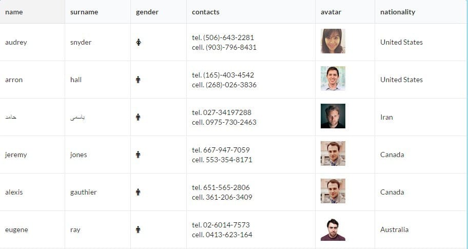
Through smart grid, data can be grouped into columns and rows. The latest release of smart HTML elements consists of various features like scrolling, paging, sorting, and infinite scrolling.
Installation:
Installing the latest version of HTML web components is very easy. You can find commands for installing any element by referring its READ ME. Today, most of the web components can easily be installed using NPM.
If you want to use NPM, type following commands to install web components.
npm i@smartelements/smart-core (This command is for core version source file)
npm i@smartelements/smart-elements (This command is for commercial version source file)
npm i@smartelements/smart-elements (This command is for a library to develop custom elements)
Folder Structure:
The folder structure of the web component grid requires 3 files; CSS, JS, and HTML.
Integration of HTML files with smart grid:
The HTML files can be integrated with the smart grid by using DIV tag. The HTML DIV Element with id=Grid can be used to create a web component. The index. Js file is a javascript module, where Grid web component will be created within a function”init”.By calling the smart grid function and passing the first argument as the id of the DIV tag and second argument as initialization with grid web, the DIV tag is replaced with a smart grid tag.
<! DOCTYPE html>
<html xmlns=”http://www.w3.org/1999/xhtml”>
<head>
<title>Grid Lazy Load Demo</title>
<meta http-equiv=”X-UA-Compatible” content=”IE=edge” />
<meta http-equiv=”Content-Type” content=”text/html; charset=utf-8″ />
<meta name=”viewport” content=”width=device-width, initial-scale=1.0, maximum-scale=1.0″ />
<link rel=”stylesheet” type=”text/css” href=”../../../source/styles/smart.default.css” />
<link rel=”stylesheet” type=”text/css” href=”../../../styles/demos.css” />
<link rel=”stylesheet” type=”text/css” href=”../../../styles/common.css” />
<link rel=”stylesheet” type=”text/css” href=”styles.css” />
<script type=”text/JavaScript” src=”../../../scripts/common.js”></script>
<script type=”text/JavaScript” src=”https://cdnjs.cloudflare.com/ajax/libs/webcomponentsjs/1.2.0/webcomponents-lite.js”></script>
<script type=”module” src=”index.js”>
</script>
</head>
<body>
<div id=”grid”></div>
</body>
</html>
Styling:
Styling of a web component can be done along with the styling of the rest of your website. You can apply CSS styling to the Grid. The following two files are responsible for styling:
Smart.base.CSS: These file styles layouts like the width of border and margin etc.
Smart. (Theme name).CSS: The HTML elements colour, background, and font, etc. can be applied using these files. While styling the web component, the smart.base.CSS file must always precede the theme name.CSS file.
A single HTML element can be styled uniquely with an inline CSS. The following example changes the text colour of h1 to blue.
Example
<h1 style=”color: blue ;”> this is a Blue Heading</h1>
For a full HTML page, a style can be defined using internal CSS.
<!DOCTYPE html>
<html>
<head>
<style>
body {background-color: powderblue;}
h1 {color: blue;}
p {color: red;}
</style>
</head>
<body>
<h1>This is a heading</h1>
<p>This is a paragraph.</p>
</body>
</html>
Grid Component’s features:
The Grid has very useful features like cell editing, pagination, and live updates. Besides, 100,000 columns and 50,000 rows can be automatically loaded. I will discuss some of these features:
Cell Editing:
If you are editing data like spreadsheets you will need cell editors. Editing in a cell can be performed in run time and the simplest way to enable editing is to set colDef.editable as true.
Live updates:
You can have updates after every second. You only need to set the interval (may be set in milliseconds) and the data will be updated accordingly.
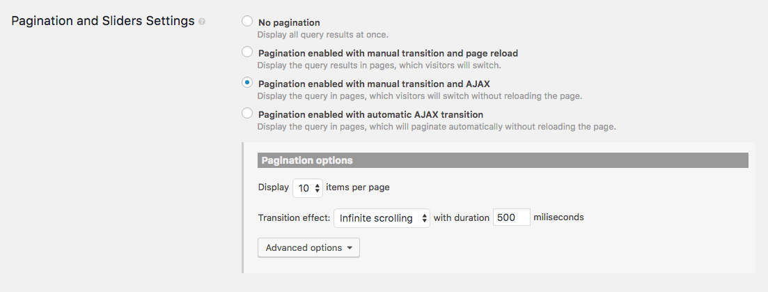
Pagination:
This is an essential property of a web component grid and can be enabled by setting pagination as true. You will have to set other properties like visibility and page size and page index too.
Practical application of grid features:
Besides some features discussed above, there are many other useful features like filtering, sorting, scrolling, and data catching, etc. You can create great functional websites or applications for your clients using various features available in the web component grid.
Talking about practical applications of grid features, let’s take the example of coupon discounts, a very hot favourite of current retail business scenario. Using these features you can develop a coupon site of your own, sharing the latest deals with your visitors. Alternatively, you can design catchy mobile phone couponing apps for your clients. With amazing features, the web component grid offers to application builders, the sky is the limit for your creative genius.
Wrap Up:
The smart HTML elements and web components can be used in any framework. The technologies are emerging and are compatible with PC and mobile phone. These help you develop eye-catching and responsive web apps. This handy guide suggests simple steps for getting started with web component grid in just 5 minutes. Start exploring the opportunities to enhance your websites by making them more functional.