You just busted your rear end off working on your client’s website. You did the final touches, finalized the design elements, fixed a few bugs here and there — the whole works.
You send the finished product to your client, maybe popping a bottle of wine to celebrate the occasion. A few hours later, the client emails you back to ask for a revision.
Web designers, or at least most of them, are familiar with the above scenario all too well.
It seems unfair, right? The client hired you, a professional web designer, to do, well, web design. It’s your bread and butter!
But let’s hold up for a moment and see things from the client’s point of view — at least this once. After all, they should be more in touch with the site’s main objectives than you. It’s their site!
So, in this blog post, we go over the major reasons why your page layouts and design are being rejected and what you can do to minimize revision requests.
Are you ready? Dive right in.
1. Objectives are Not Well-Defined
There will always be clients who won’t give you a detailed account of how they want their website to look like.
More often than not, it’s because they aren’t sure themselves, at least the first time around.
Clients, however, have a habit of magically coming up with design ideas or suggestions while you’re already in the middle — or worse, the tail end — of your process.
And then they ask you to revise your work, sometimes confronting you for not meeting their expectations, which were not established in the first place.
It’s not a fun situation to be in.
The best way to avoid this scenario, of course, is to make sure that the project’s goals and objectives are established and well-defined since day one.
For instance, is it your client’s goal to get more subscribers? Or does he want to pique the interest of the brand’s target audience?
Once these objectives are established, you will know which design elements, like CTA buttons, background images, and font styles, should be put on the page.
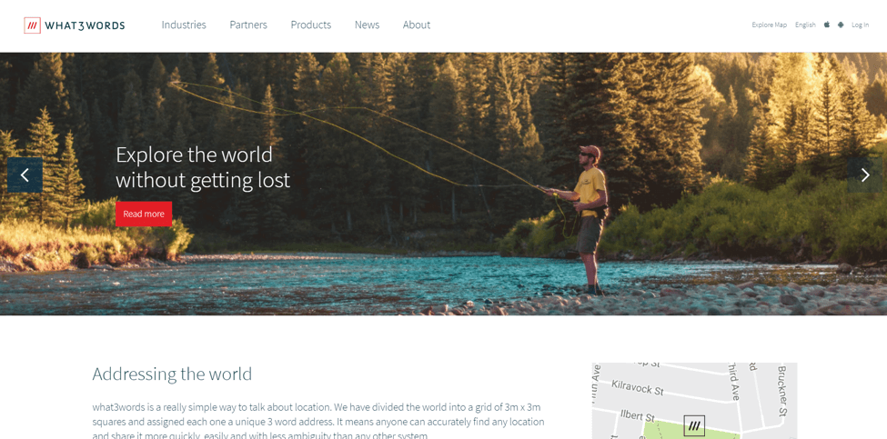
Take for instance the web design work done on What3Words.com as shown below. The visuals alone make a huge impact, but it also directs your eyes to where they need to go.When your client knows that your creative decisions are aimed towards achieving their website’s goals and objectives, they’ll be predisposed to approve them in the future.

When your client knows that your creative decisions are aimed towards achieving their website’s goals and objectives, they’ll be predisposed to approve them in the future.
2. Lack of Communication
If you’ve been doing web design long enough, chances are you’re more than familiar with the amount of work required to finish a full-scale web design project.
From defining the project’s scope and wireframing to mapping out the site’s architecture and choosing the visual elements that go with it — the entire process can be rigorous and unwieldy.
But here’s the point: even if the entire design process is going smoothly for you, that is never a guarantee that the client will like the final product.
To ensure that there won’t be any misunderstandings in the future, you have to communicate with the client during each phase of the design process.
Did you make a bold design choice that you feel will make the CTA button stand out? Tell your client about it.
Do you think changing the color of the logo to a darker shade will serve to emphasize the brand’s aesthetic better? Yeah — you should tell your client about it as well.
Constant communication ensures that you and your client are always on the same page, preventing differences and disagreements that may delay the project’s completion.
If you and your client are communicating exclusively via email, it’s about time you use an alternative communication tool such as Skype. Using Skype is pretty much standard communication procedure in most client-contractor relationships.
3. Your web design is not optimized for mobile
The importance of mobile-friendliness on the web these days can’t be emphasized enough.
According to Q4 2017 results released by Statista, 51 percent of global web traffic comes from mobile devices. Google also rolled out mobile-first indexing last March 2018.
The point? If you’re designing web pages without mobile optimization in mind, you’re setting yourself and your client up for failure.
That said, your client probably already knows that mobile optimization is a must, and will reject your desktop-only design as a result.
There are two approaches to creating a mobile-friendly website. The first one involves creating a new and unique mobile website from scratch.
There’s also the more popular option, which is to implement a responsive web design.
Before picking one over the other, you have to bear in mind that each option has its own set of pros and cons.
Creating a mobile-friendly design from scratch may offer more flexibility in terms of functionality. On the other hand, responsive design allows your website to scale and adapt accordingly to multiple devices.
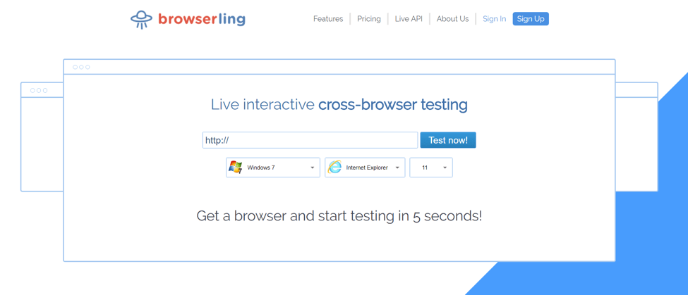
Either way, using a cross-browser testing tool like Browserling should help you figure out what works or not based on your client’s specifications and project goals.

4. The Design is Getting in the Way of User Experience
Back in the day, web designers can get away with anything.
Most clients don’t mind if their web pages are peppered with fancy flash animations or complex designs. If the website looks beautiful, then you have done your job well.
But again, that was back in the day.
These days, users prefer simplicity over complexity. Clients are aware of this, and while they do care about the site’s visual appeal, they want to make sure that it doesn’t get in the way of user experience.
In this brave new world of engagement metrics and conversion funnels, you have to take into account user experience in the design process.
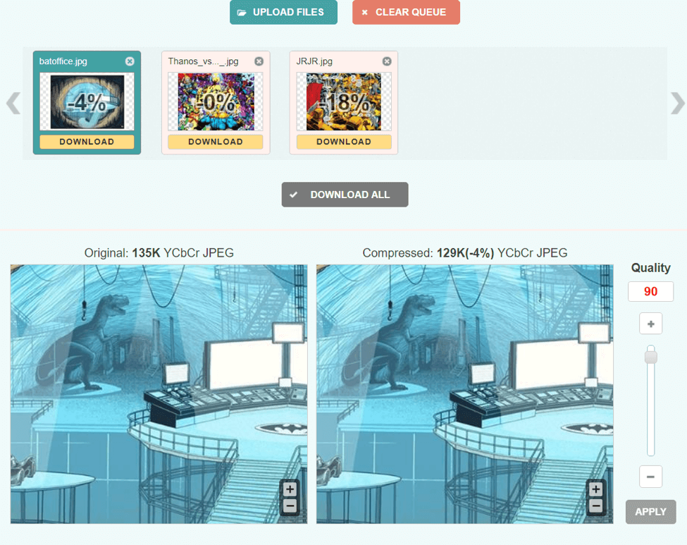
For starters, it goes without saying that visuals with large files can slow down a website. As such, proper image optimization is in order.
Using lossless compression tools like Optimizilla or Compressor.io, you can radically reduce the sizes of your image files without diminishing their quality.

And while you’re at it, you’d do well to discuss with the client other factors that may negatively impact website’s performance and loading speed.
For instance, if your client is also catering to an international audience, you can suggest that they use a CDN (content delivery network), which is a network of cache proxy servers located in different parts of the world.
Because they’re widely distributed, these proxy servers store and transfer website data from the host server, reducing the loading time of your website regardless of the user’s location.

Final Word
Web design requires a lot of hard work, but you’ll find that the job becomes much easier if you and your client are able to see eye to eye in every aspect of the design process.
Taking into account the problems mentioned above should go a long way to ensuring that your business relationship with your client becomes more productive in the future.
Have you had your web design work rejected before? If so, how did you go about it? Tell us in the comments section below!

