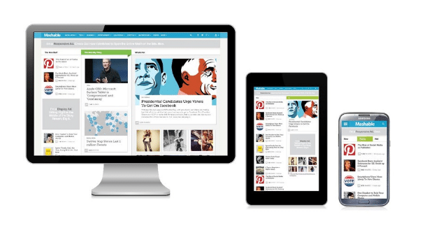
I wonder what screen you are reading this on. Laptop perhaps? Or maybe it’s one of those jumbo sized displays? Or you could be thumbing down with your smartphone. Do you love the experience?
From modern perspective, responsive designing makes it possible to help you view websites seamlessly as you change devices. Before the advent of the cellphone revolution with advanced web browsing capabilities, website designers never had to design their websites for multiple screens. Desktop monitors looked generally the same and with some minor tweaks, they could run them on any monitor connected to the internet across the planet. But with factors such as screen size, pixel resolution, click versus touch, support for Adobe Flash, optimized markup and others in play, web designers had to up their game.
With mobile phone sales trumping desktop merchandise every year, you need to improvise your website designing strategy if you intend to garner revenue with Search Engine Optimization. This calls for tweaking your archaic desktop-centric website (if you still run one) and emphasise on making it more nimble and able to run on cellphones of any screen size or operating systems.
Here are four advantages that Responsive Designed Websites bring to the table:
#1 – One site to rule ‘em all!
Generally known as “mobile only” sites, websites often create a separate website designed for phones and transfer users who are approaching them from the smaller devices. Though it does work to a certain extent, where this plan falls apart is in content disparity. Mobile websites are skinned to cover just basic features and the user may find himself at a loss. Besides, managing multiple websites is a pain!
Better stick with creating a website that can be universally accessed by smartphones and desktops alike.
#2 – Super flexibility
With content moving freely across screens of multiple dimensions, responsive website designing allows intuitive movement and ease of movement. As newer devices with screen sizes are launched into the market in the near future, your websites will be able to scale itself to its dimensions.
#3 – Excellent User Satisfaction
Content remains king but User satisfaction is what counts as success metrics. Responsive websites ensure that the user remains satisfied despite which device he/she uses and provides seamless quality website for his/her consumption of information.
#4 – Keeps costs down
Responsive websites do take a while to stitch together but they tend to outlast their compatriots longer. Which means support, patches and updates can be uploaded at the same area than multiple websites. With an optimised and responsive website, the user gets his information faster which makes his/her life easier.
Why we love a responsively designed website?
Any website regardless of its responsibilities or goals will greatly benefit from efficient designing. If it runs fluidly on all screens, that results in easier navigation and happier users. The durable nature of this strategy is incredibly efficient and the cost effectiveness a crystal clear advantage.
Is your website capable of running fluidly across all devices?